Handling Overflow in Multicol
In this guide we look at how multicol deals with overflow, both inside the column boxes and in situations where there is more content than will fit into the container.
Overflow inside column boxes
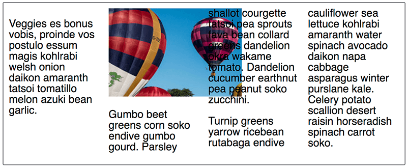
An overflow situation happens when an item's size is larger than the column box. For example, the situation could happen when an image in a column is wider than the column-width value or the width of the column based on the number of columns declared with column-count.
In this situation, the content should visibly overflow into the next column, rather than be clipped by the column box. You can see an example of this below, with an image of the expected rendering as, at the time of writing, browsers deal with this differently.

If you want an image to size down to fit the column box, the standard responsive images solution of setting max-width: 100% will achieve that for you.
More columns than will fit
How overflowing columns are handled depends on whether you are in a fragmented media context, such as print, or a continuous media context, such as a web page.
In fragmented media, once a fragment (for example a page) is filled with columns, the columns will move to a new page and fill that up with columns. In continuous media, columns will overflow in the inline direction. On the web this means that you will get a horizontal scrollbar.
The example below shows this overflow behavior. My multicol container has a height and there is more text than space to create columns, therefore we get columns created outside of the container.
In a future version of the specification it would be useful to be able to have overflow columns in continuous media display in the block direction, therefore allowing the reader to scroll down to view the next set of columns.
Using vertical media queries
One issue with multicol on the web is that, if your columns are taller than the viewport, the reader will need to scroll up and down to read, which is not good user experience. One way to avoid this is to only apply the column properties if you know you have enough height.
In the example below we have used a min-height query to check the height before applying the column properties.
In the final guide in this series we will see how Multicol works with the Fragmentation spec to give us control over how content breaks between columns.